Easy Ordering & Delivery: Designing for Seniors in a Pandemic
When COVID hit Texas, we had two months to figure out how to keep Texas Seniors safe.
Background
It’s March 2020. Texas’s Governor tells residents to stay home except for essential activities.
At Favor, Texas's most popular on-demand delivery platform, we knew our most vulnerable users (senior citizens) needed help staying safe.
But at the outset of COVID-19, there was a dearth of information about what safety meant. Could I still go to the grocery store? Could COVID-19 be transmitted via packages?
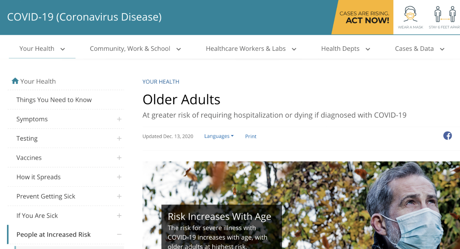
Amidst this landscape of uncertainty, most grocery stores in Texas were opening an hour early for senior shopping hours. But our parent company, H-E-B, the most popular grocery chain in Texas, wanted to do more. They wanted to partner with Favor to provide groceries for vulnerable Texans in the place where we knew they were safest: their own homes.
Our service landscape was changing overnight. Favor was making the transition from a occasional consumer treat to an essential service. But we had a problem. Our platform was largely built for ordering tacos and Thai food, not for 75-year-olds trying to get groceries delivered. And we needed to figure out how to serve as many older Texans as possible with very little time.
The Volunteer Hotline That Showed Us What We Needed
We didn’t want to wait to start serving as many seniors as possible, so Favor & H-E-B teamed up to create the scrappiest MVP imaginable: a hotline staffed by volunteers from across the two companies. Volunteers would take calls from seniors, manually create orders on their behalf, and coordinate delivery.
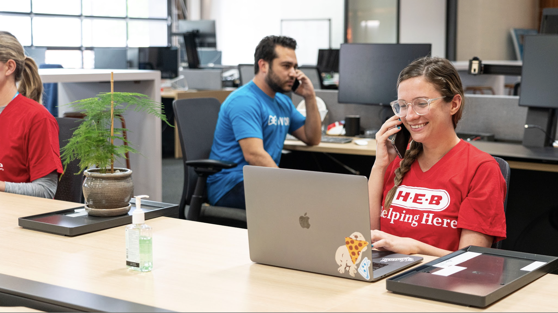
I recognized that this would give us amazing insight into what seniors needed from our platforms and services at this time and help us understand if they were having trouble ordering groceries from our site on their own. So I volunteered for shifts working the hotline. So did my team.
Discovery 1: Seniors had trouble ordering groceries from our website
What we learned reaffirmed what we had heard in previous research: seniors understood our platform’s design for ordering food, but when it came to groceries (the brands! the substitutions!), it completely confused them.
I had previous a previous research study I had run pre-pandemic, studying website usage among older adults across different contexts. In this previous testing with seniors, we'd learned:
Mental Models: Seniors described grocery shopping as "making a list,” a completely different approach than our restaurant-focused cart experience
Usability: Our website was especially hard for this demographic to navigate for grocery orders
Linearity: This group wanted a step-by-step, linear flow. Our platform let users jump around freely, which created confusion
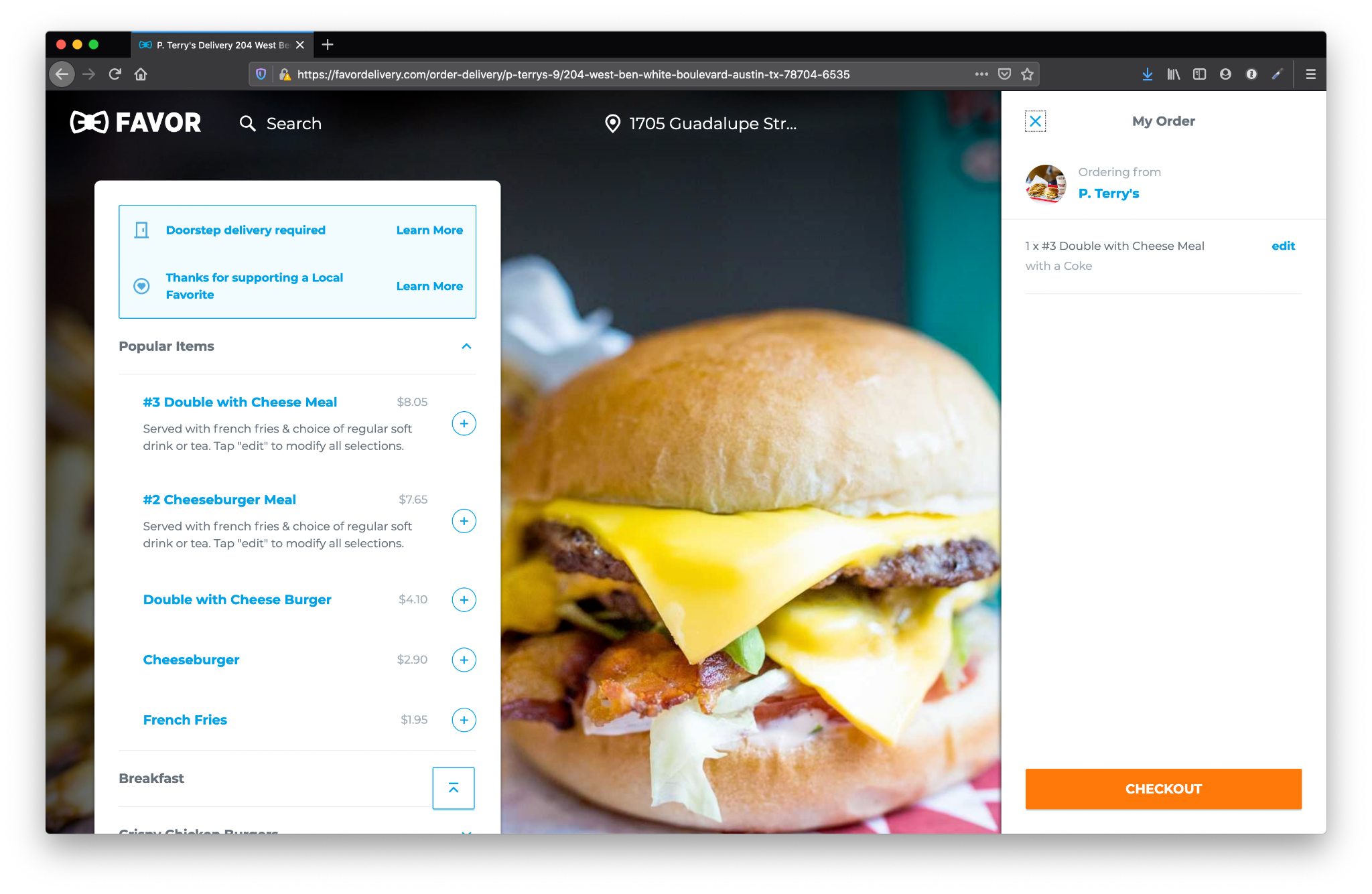
"I like all the restaurants. But I don't understand how I build a grocery order."
—Test participant from previous user research, 67 years old
The biggest problem was our missing critical grocery features. We'd never built for the realities of someone shopping on your behalf (substitutions, stock issues, back-and-forth communication). This was a completely different use case.
Discovery 2: Scale was an issue
Another part of our MVP involved subsidized delivery: our parent company, H-E-B, wanted to offer seniors free delivery to serve as many people as possible during a time when people across Texas really needed it. But there was a ton of manual overhead involved: volunteers were given a free delivery code, good for 24 hours, and each morning would need to check in to receive a new code.
I realized: this wouldn’t scale. The volume was growing day-by-day, with phone wait times reaching an hour at times. The overhead too great. We needed a product solution that people could use independently.
Approach
Setting the Design Strategy: Speed, Simplicity, and Matching Grocery Mental Models
I led a team of one other designer, one PM, and five engineers. Our full-time researcher was tied up on another crucial COVID project, so I pulled double duty as researcher and design lead.
I mapped out our execution plan:
⏳
No time for low-fidelity: We'd go straight to high-fidelity designs and get them into user testing immediately
📋
More explanation: This was a complex moment—items out of stock, someone shopping on their behalf. We needed to set clear expectations
🦾
Accessibility-first approach: Simple colors, higher contrast, simpler UI, more text
Designing Under Brutal Constraints
The constraints were intense:
🔨 Engineering: We had to build on top of our existing system with a tight turnaround
⏳ Time: No runway: we needed to start building and testing ASAP
👤 Accounts: For the first time, we needed to support ordering with no account, accommodate landlines and users without email
📱 Technology: Many seniors had no mobile phone or email
💙 Preferences: We needed to handle substitutions and brand preferences without overwhelming users
And here was the central challenge: How do you design a grocery delivery platform with no stock information? H-E-B couldn't provide real-time inventory data, because in the early days of COVID, everything was in flux. We had to design around complete uncertainty.
Rapid Iteration with Built-In Testers
We created a bare-bones MVP for a website we called Easy Order and immediately had people start using it. We had something most product teams never get: a highly engaged built-in testing group who were used to things being in flux and ready for our experiments. The volunteers who'd been staffing the hotline, many of whom were seniors themselves, did a lot of our early testing.
We split our volunteers into groups: some volunteers continued to use our old volunteer call script, where they placed orders for our users on the original website. Some volunteers placed orders for seniors using our new Easy Order MVP. Other volunteers walked seniors through early versions of the site. We gathered constant feedback in Slack, prioritized changes, and shipped updates daily.
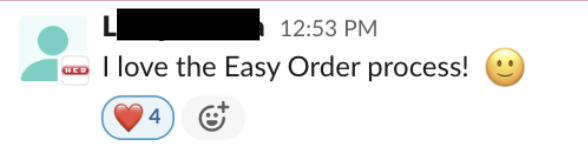
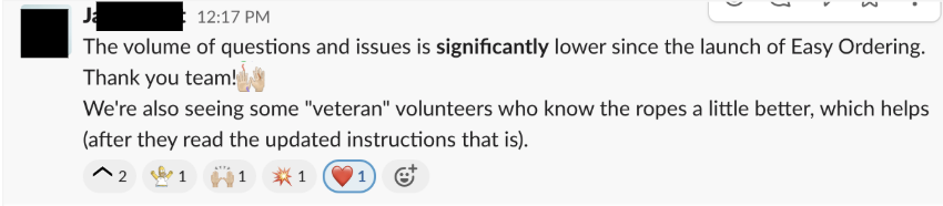
The early feedback told us we were on the right track:
📚
Tell a familiar story: Step-by-step, like making a list. A linear, wizard-like interface.

User testing the live experience with Seniors
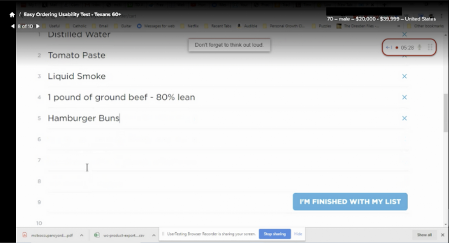
I ran usability tests with 8 seniors (Texans, 60+) through UserTesting.com, asking each to order groceries through the live experience end-to-end.
The headline: it worked! All 8 completed the task, and most called it easy and simple. The large font carried real weight for this audience, and several said they'd use it for real. One put it plainly:
“I love this because H-E-B is my store.”
—Test participant
The friction clustered in a few places, and those became our revision list.
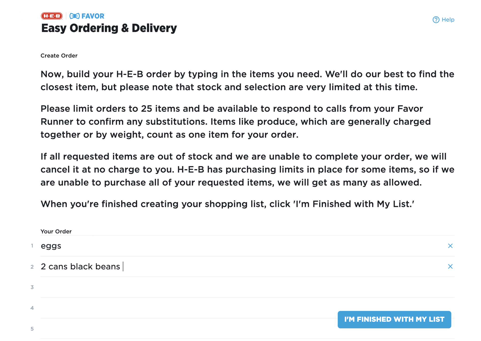
The grocery list was the biggest issue. Every participant typed their list as free-form word vomit, interchanging quantities and sizes at random. That raised an obvious question for the Runner doing the shopping: which eggs, which milk, what brand, how many pounds? Seniors who'd used H-E-B delivery or curbside expected the field to be interactive, suggesting items as they typed, and weren't sure what they'd actually end up with.
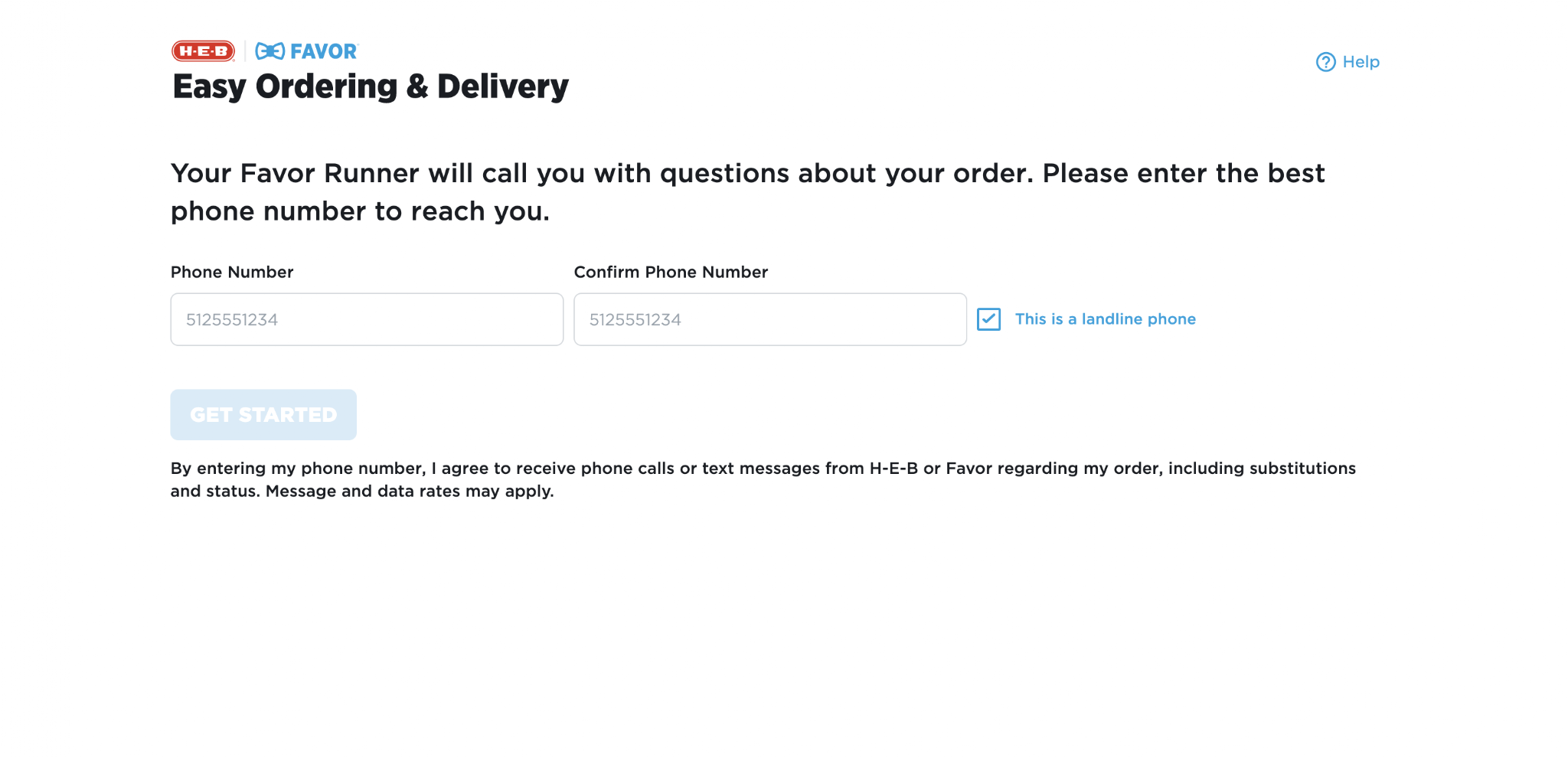
The phone number field caused the most confusion. It wasn't clear whether dashes or spaces were required, and a wrong format was hard for seniors to troubleshoot on their own.
The hero image on the homepage was too tall. In a few sessions, seniors didn't realize they needed to scroll past it to start their order.
Instruction fatigue set in early. Participants hit three screens of directions before they could write a list. A couple were worn out by then, and one skipped the text entirely and just filled in fields.
The strongest signal was intent. Seniors wanted this to be real, largely because it came from a store they already trusted.
Final Designs
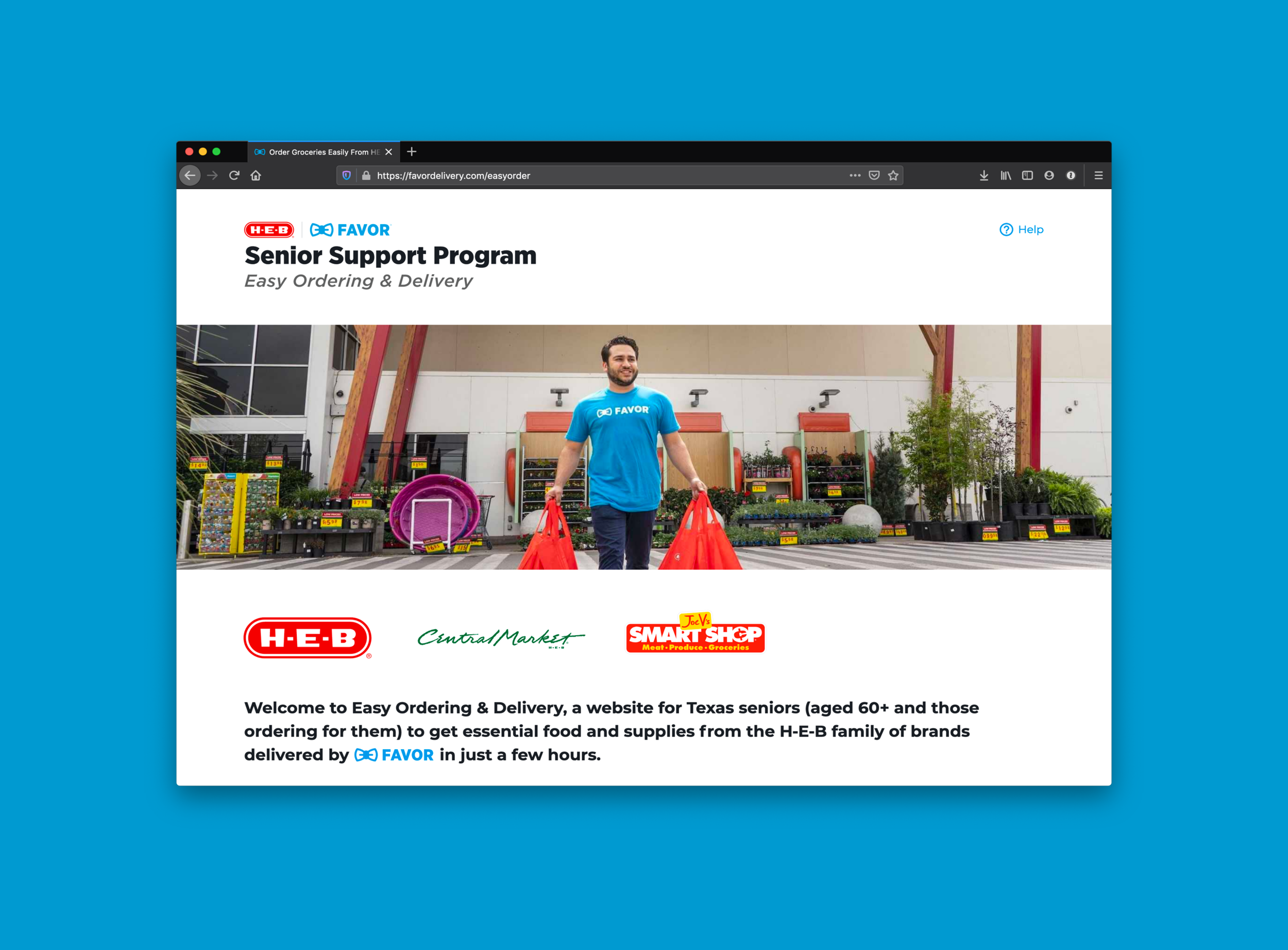
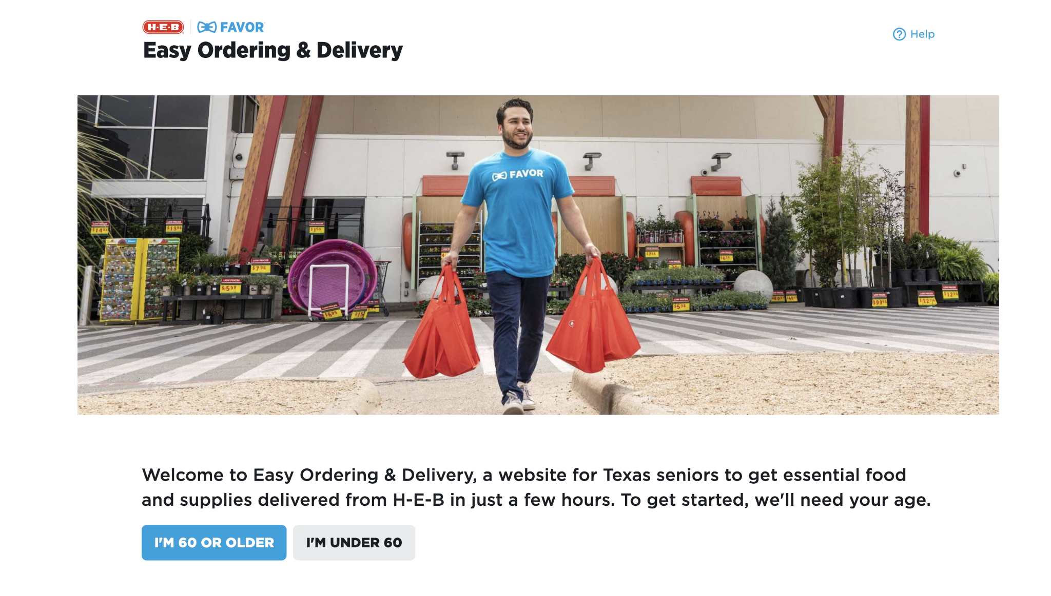
Easy Ordering & Delivery
A little over a month after we started, we released the Easy Ordering & Delivery website to the public. While it had been specifically designed for seniors, we made it available to all users, with special flows that allowed free delivery for seniors.
Final flow
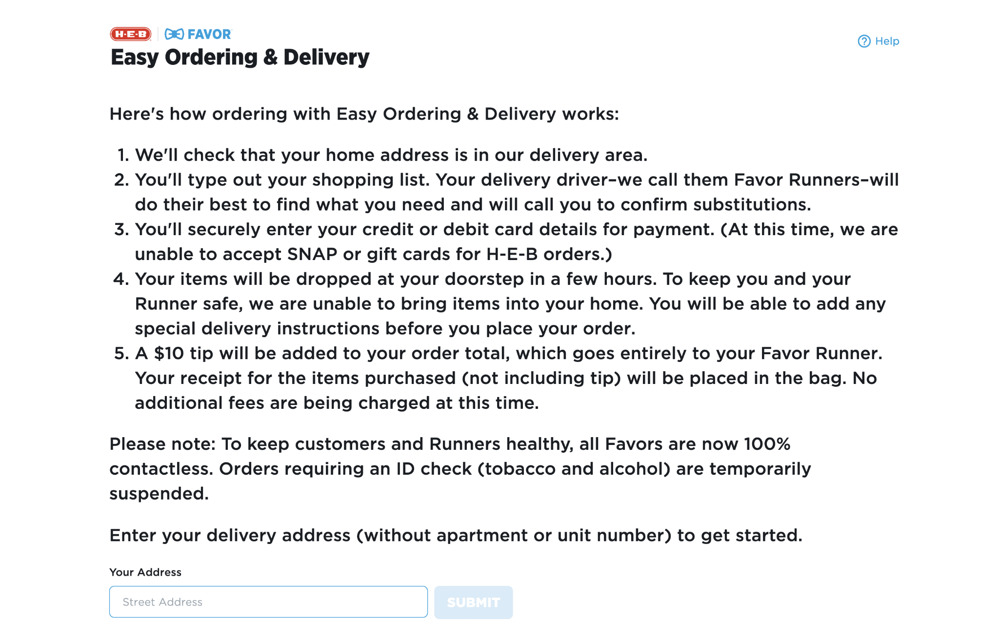
Homepage: Gathered eligibility (since we were doing free delivery for seniors only) and set expectations about the service
Program Explainer & Address Check: Explained program, current limitations, and gathered delivery location. If they were outside our delivery area, we'd route them to other community services
Phone Number: Determined if we could link to an existing Favor account or needed to create a new one. Accommodated landlines for the first time, giving delivery runners instructions to call for substitutions via corresponding changes in the Runner mobile app.
Create Order: Let them build a list of items with examples. We later added quantities, auto-complete, and quick-add for most common items
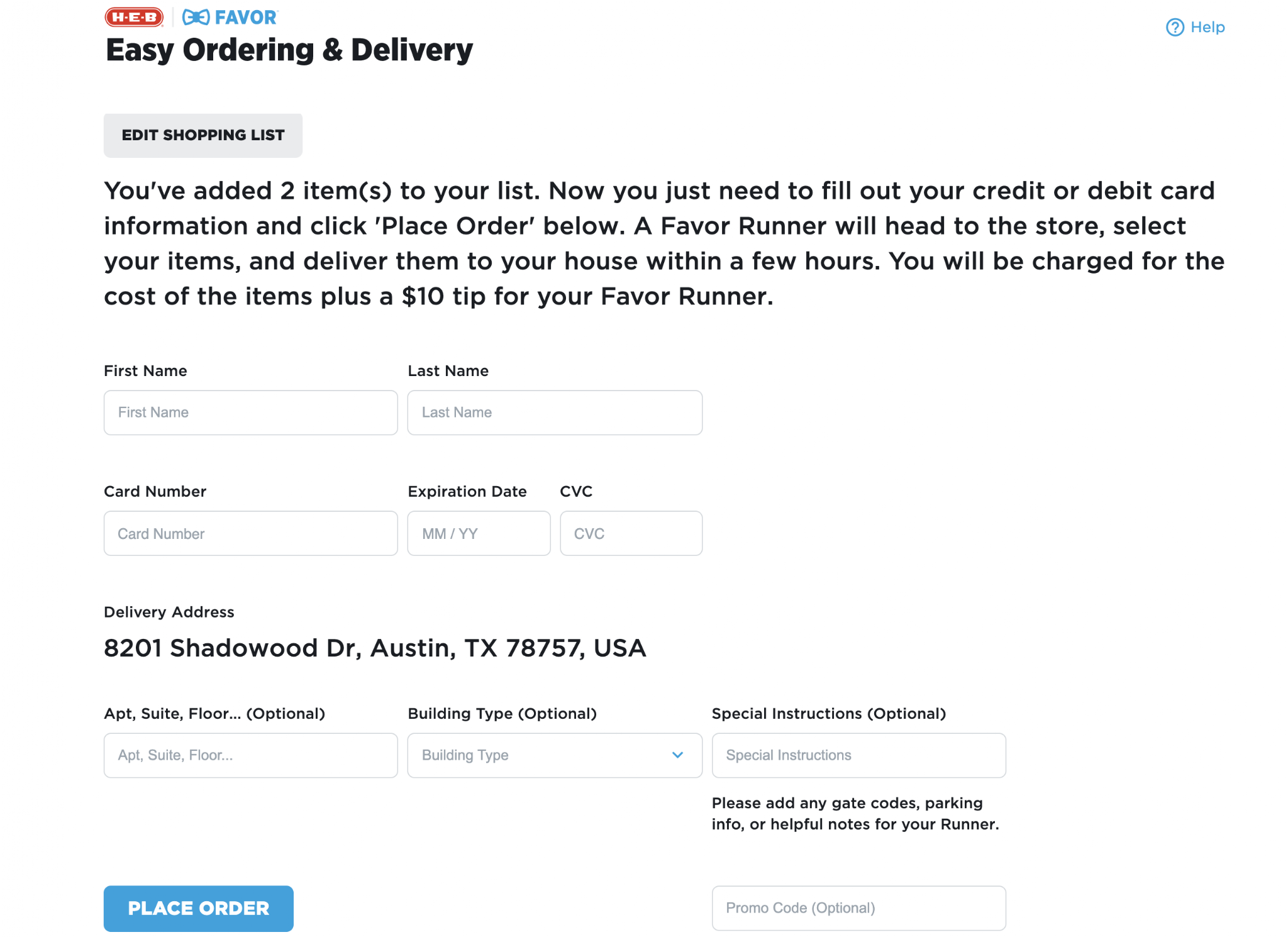
Confirm Order: Set final expectations and prompted for additional address details before placing
Results & Learnings
What we accomplished
by December 2020
👩🏻💻
121,928 orders placed through Easy Ordering Platform
🔟
Nearly 10% of Favor's total order volume that year
👤
83,796 individual users served
🤗
Kept vulnerable Texans safe during the most uncertain phase of the pandemic
Key learnings
I thrive as a player-coach. When our full-time researcher was tied up on other high-priority COVID projects, I ran the sessions myself. I also made the call to skip low-fidelity iteration and test straight in high fidelity. Hands-on, fast-paced, steeped in product strategy and quick iteration: that's the work I do best.
There's no one-size-fits-all process. You can have an ideal way of working and still have to throw it out because people need you. The process shrinks or expands to fill the need.
Look for the helpers. We leaned on our volunteer network as early testers to move faster. Beta groups, customer councils, volunteers: the network you already have is the quickest path to iteration.
What's good for one group is often better for everyone. The senior-friendly principles we defined here went on to shape grocery design across the company. Design for the people at the edge and the center benefits too.
Where we went next
The insights from Easy Ordering transformed how we thought about grocery ordering for everyone. We rolled everything we learned into updated designs for Favor's core mobile app. Turns out, the linear "making a list" approach wasn't just better for seniors. It improved the experience for everyone ordering groceries.
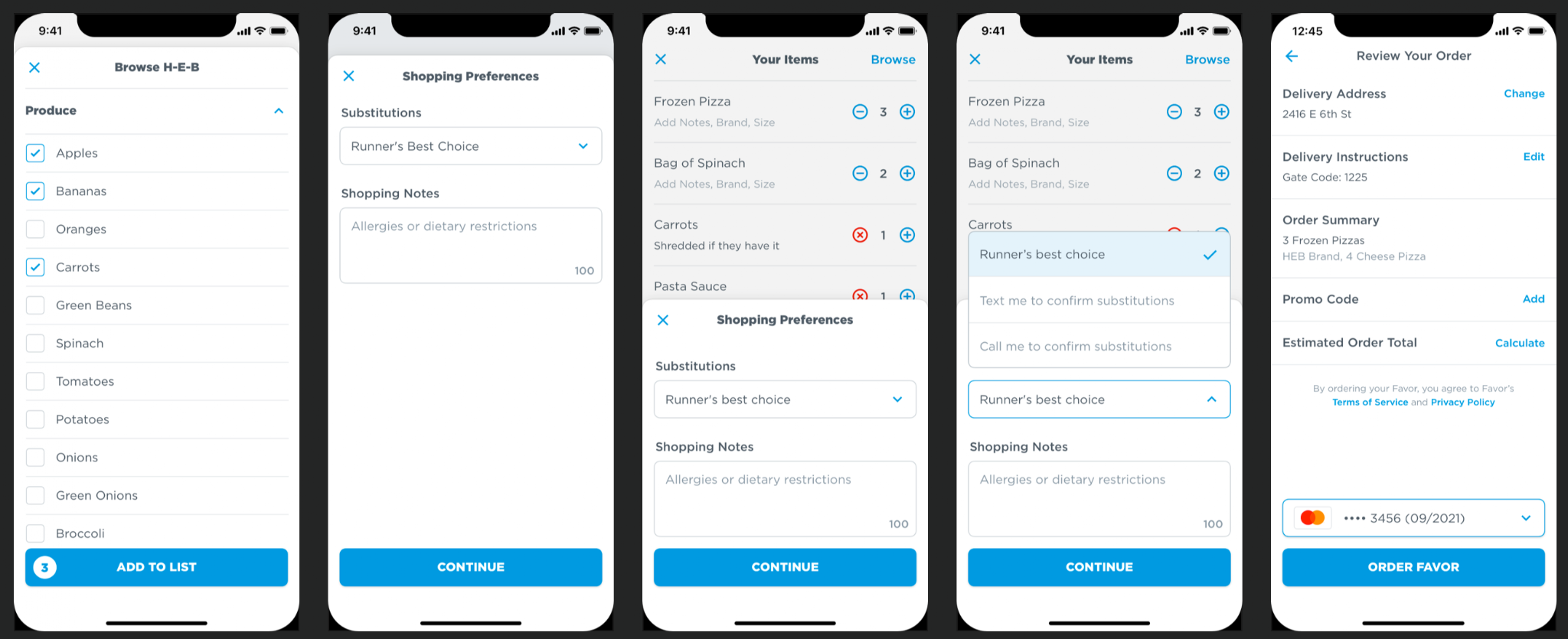
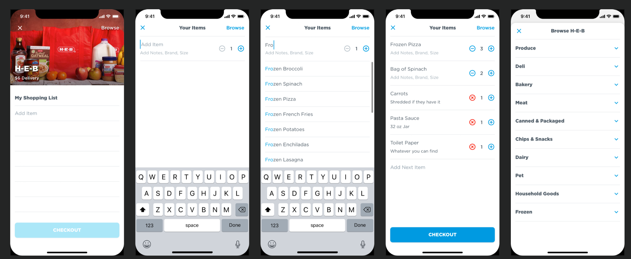
The work strengthened our relationship with H-E-B, leading to Favor becoming their largest grocery delivery partner and setting the foundation for increased collaboration.